Improving cardiac arrest alerts response rate among Singapore's First Responders
Type: Conceptual project - Add A Feature
Role: Research, UX design
Timeline: 80 hours
Things learnt: Working with existing UI systems
Overview
In 2022, Singapore first responders had a 82% response rate to minor fire cases. But cardiac arrests had a 54% response rate.
Hence, this capstone aims to address the reluctance among first responders to respond to cardiac arrest alerts. Some hypotheses for this reluctance are a lack of confidence in performing CPR, potential guilt if the patient passes, and internalised fear that the CFR could have done more.
THE BRIEF
Background
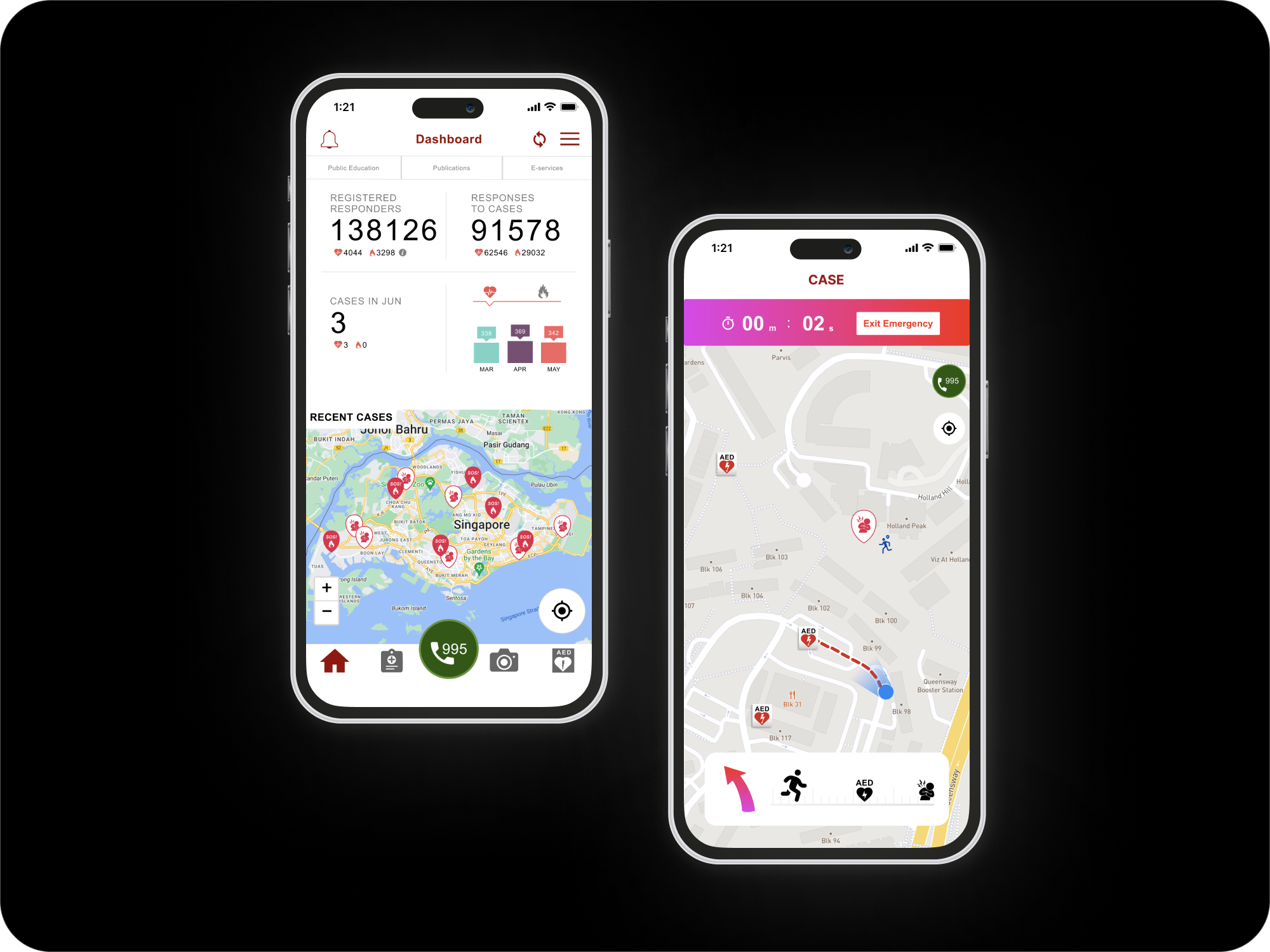
The goal of myResponder is to notify members of the public – also known as Community First Responders (CFRs) – of cardiac arrest and fire cases within 400m of their location. This increases the survival rate, especially for Out-of-Hospital Cardiac Arrest (OHCA) cases.
The Many, Many Constraints
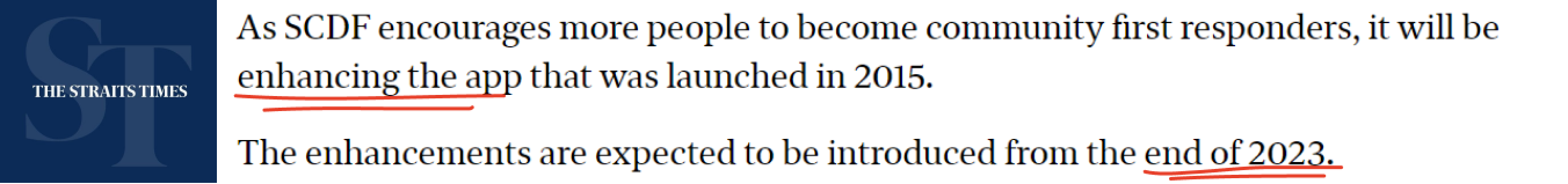
The features proposed in this project must be distinct from GovTech’s version in end-2023 so I can try to add value to the application.
The application must be able to contain highly accurate and continuous geolocation without ruining the device’s battery. At the same time, it must not take up too much space in one’s phone so that users will not delete it to make space for other applications. The existing UI framework of myResponder will be followed closely without redesign. Due to the 80h timeline, the most critical aspects will have to be prioritised. Government work is a highly regulated space; hence accessibility must be complied with. The application load time must be optimised (ie. functional but also lightweight)
Objective
To research, design, test and iterate a new feature that addresses increases CFR response rate to cardiac arrest alerts.
Feature
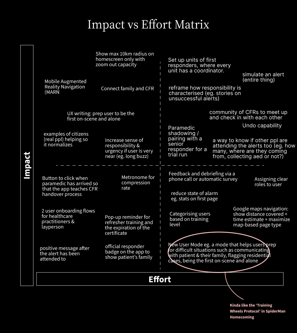
PRIORITISATION
Which Feature to Pick?
After compiling secondary research, competitor analysis and conducting user interviews, there was more than enough ideas on the table.
I created an impact vs effort matrix to group up the ideas then began the process of elimination.
Features most likely to be included in the GovTech revamp will be rejected. That eliminated ideas like video capabilities, and increasing radius to 1km instead of 400m. High effort, low impact + high effort high impact features were similarly rejected due to timeline. Features that will burden the app’s functioning capabilities? Struck out as well.
CHOSEN FEATURE
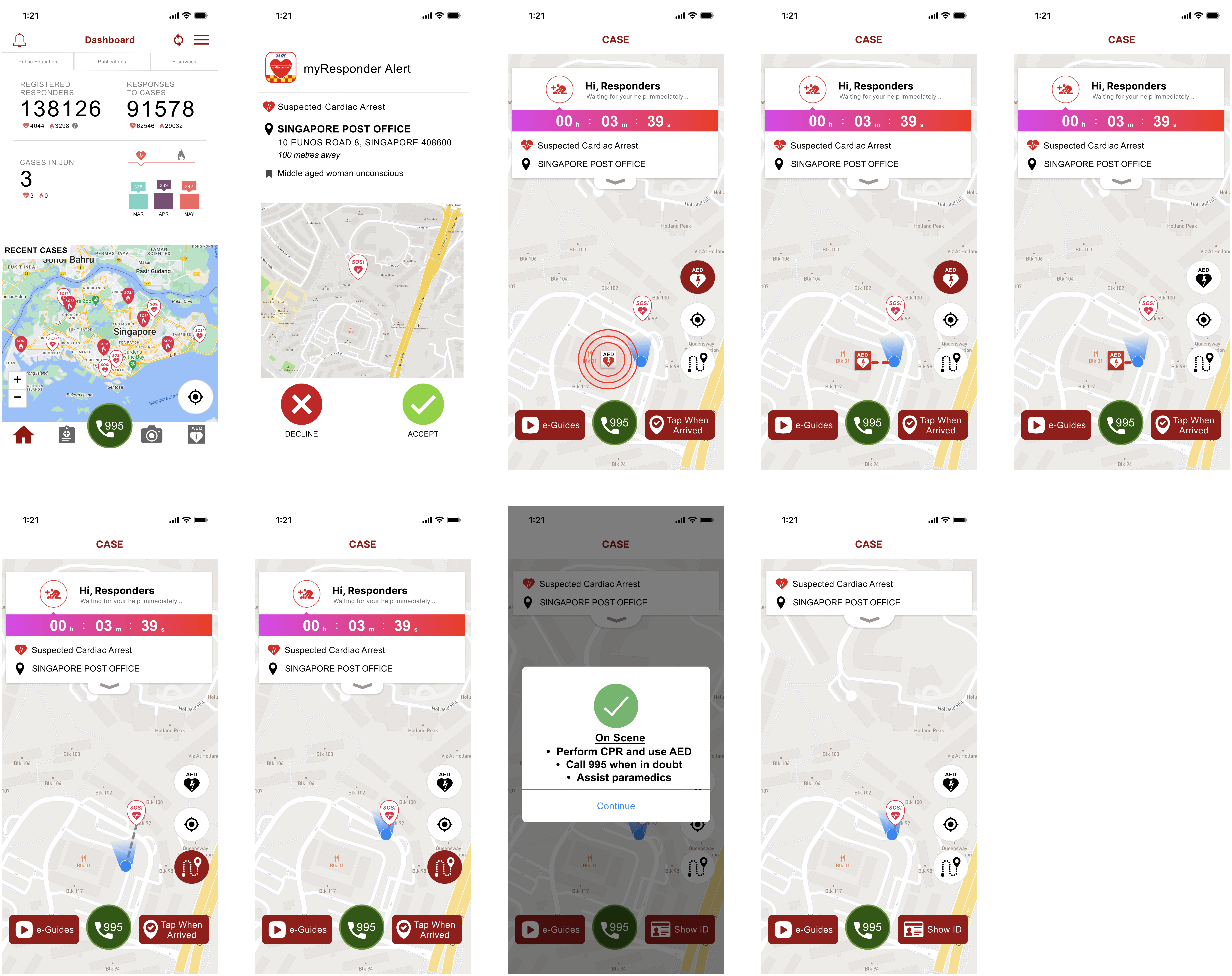
Prep Mode
I decided to go ahead with the prep mode feature to assist first responders hesitant to accept cardiac arrest alerts. Features of Prep Mode include: partnership with senior responders during alerts, guidance beyond reaching patient, and paramedic Handover Detail.
Features include the following
A. Before alert: 1) option to turn off prep mode, 2) flag alerts occuring at residential areas, 3) friendly commentary
B. During alert: 1) official responder badge to show patient's family, 2) prompts to say to patient and their family
C. After alert: 1) create sense of community with statements like "You are a part of 11 responders who have saved a life this month.
Branding Process
Stage 1: The feature was called the 'New User Mode'.
Stage 2: Help mode — as new might deter experienced healthcare practitioners
Stage 3: Support mode — as 'help' has tutorial vibes and most people don't like looking at tutorials these days its basically trial and error
Stage 4: Prop mode — was running out of ideas and ended up googling synonyms of support hence this. But again, this term sounds like a crutch required to stay upright. Perhaps not the most appealing term for first responders looking to help others.
Stage 5: Prep mode — changed letter 'o' to 'e'. It's short, simply and user-friendly such that people get what it means without feeling patronised.
I also decided against inclusion of emojis. Though with the potential for more usability, government applications need to abide by regulations and emojis may not be viewable across all mobile phones.
Usability Fix
OH NO MOMENT BEFORE CREATING USER FLOWS
The UI design I couldn't choose
I expected to be frustrated by the limitations of pre-selected branding and design for this project. What I didn’t expect was the design to be unusable for brand new users. I realised all users interviewed were screened to require prior experience using myResponder. Meaning, they have either been through the in-build tutorials given by the app, and/or attended real life cases. But can a new user successfully navigate myResponder without following the in-app tutorial beforehand?
STEP 1: REPLICATED ORIGINAL APP SCREENS ONTO FIGMA (VERSION 1.0)
STEP 2: CONDUCTED USABILITY TEST ON THESE ORIGINAL SCREENS
Target audience was first aid certified people of all ages who have never used the app before. Conducted both online and in person on Maze.
STEP 3: FOUND A NEW PROBLEM
8 out of 10 participants failed to complete the task. There was also a shocking 61.1% misclick rate.
Though I cannot change the UI design or branding and only could add a feature, this app was made in 2013 or something. I had to bend the constraints a little bit.
“Because an app that is not usable will NOT be any better with a new feature added.”
CREATING A MORE USABLE DESIGN
Version 2.0
I tried to keep the existing design as much as I good and made the bare minimum changes required to ensure usability of the app.
Usability test was designed in such a way that all users WILL complete the task regardless of mistakes made. This is so I can narrow the scope (given the timeline) & focus on things like time taken, no. of misclicks etc, without having to make too many large scale changes. Because the end goal is just adding one feature. The usability test was moderated, and conducted both online and in person so I can ask impromptu questions based on user actions.

Wireframing
NOW LET'S GET BACK ON TRACK
Low Fidelity Wireframing 2.0
I tried to keep the existing design as much as I good and made the bare minimum changes required to ensure usability of the app.
Usability test was designed in such a way that all users WILL complete the task regardless of mistakes made. This is so I can narrow the scope (given the timeline) & focus on things like time taken, no. of misclicks etc, without having to make too many large scale changes. Because the end goal is just adding one feature. The usability test was moderated, and conducted both online and in person so I can ask impromptu questions based on user actions.
INSIGHTS
2nd Usability Testing
The usability test was moderated and conducted both online and in person.
Both tasks (1. attending a cardiac arrest alert and 2. signing up to be attached to a senior responder) had a 100% completion rate. Most notably, both tasks had a much lower 14.7% misclick rate thus showing that creating Vers 2.0 in the middle was a good idea. All 10 users also ranked that they are highly confident in attending cardiac arrest calls in the future.
Reflections
Key Findings
Unclear Senior CFR Icon
Unclear 2nd page of usability test. One user assumed the senior CFR represented themselves instinctively since they had a human icon.
Senior CFR icon was confusing for users. Because at first they thought someone was rushing to the patient already so they don’t need to accept.Also, distinguishing them as a human and user as a blue dot creates a separating feeling. Currently, it makes user "feel like not as much of a person" hence a dot might be better.
Awkward moments
Interviewing real life users proved incredibly valuable once again. Two users who have attended real life cases brought up the ironic moment of “What if the patient just died? You wanna give them a bright green success is it?”
User assumed the feedback was to let paramedic know of the user’s personal wellbeing so should maybe clarify. They felt a questionnaire/feedback for user’s own wellbeing will be good.Instruction for showing ID didn’t make sense to one user. Felt that it should be clarified why they need to show ID, when etc. Rephase congratulations in last screen to something like thank you or good job. Don’t take instructional tone in final screen at “Practice self-care”. Statement about the button first might be better. No one wants to keep getting instructions up till the very end - will get a bit sianed out.
Improve UX writing
The term CFR can be confusing. Make it layman or spell it out as community first responder. Instead of begin handover to paramedics can include the details to inform paramedics of. Remove “No problem” sounds sassy to some users.
Misc design details
Users like the AED toggle. Enjoyed green colour. Liked that it was a swipe as it feels nicer compared to a click.
Alignment of handover process is odd and bothers users (I agree) Some debate on arrow design. Current version or a right angle design?Font size of instructions popup at top of screen too small especially for older responders. Within decline alert button form, might be a bit hard to see where the pop up box starts as it merges with the screen behind.
Users felt guided
They expressed that the design made them feel like “[their] experiences mattered” Appreciated that there was no predicted time. Eg. You will reach patient at XYZ. But if user's ankle sprained or they aren't very fit, “I don’t want to feel like I should have run faster. I don’t want to feel bad about that in hindsight”.On a scale of 1 to 5 (very confident) user felt 4. Cos “very guided, calming”.
Users were largely more confident in this trial compared to the first usability test and appreciated how “instructional”, “numbered”, and “clear” the process.
Users liked the fact that the waiting time of paramedics to arrive was displayed. Users felt like the automated vibe, remove some level of responsibility from them which they appreciated. It carries the idea that you’re not responsible responsible - this is good as when designing, I wanted to toe the line of gamification and real life.
Challenges Faced
Difficulty replicating emergency situations
When conducting the usability test, it was difficult to get users into the real life framework which is crucial for a time-sensitive app like myResponder. This makes it hard to gauge accurate responses. So to err on the side of caution, I’m going to assume the real life usability will be slightly worse than predicted ones during usability tests.
Deviating from design thinking process
It was a bit of a ride going through the whole thing, as I ended up having to bend the design thinking process a bit by conducting usability tests on the original app itself. Then another usability test on version 3.
Limited interviewees
Its difficult to find people who actually use myResponder app, or even at the very least are interested in using it. So a lot of secondary research had to be done based on existing peer-reviewed studies to understand the motivations and pain points of users as best as possible.