Digital presence for the rooted in tradition practice of Iyengar yoga
Type: Client Work
Role: Research, UX design, Branding, Web Development
Timeline: 80 hours
Things learnt: Webflow development, Stakeholder management, Mobile-first Responsive Design
Client Meet
After becoming a wellness industry staple, yoga is taught without cultural respect, nuance, and the gravity of tradition. The practice has become diluted in many regions of the world.
THE BRIEF
In June 2023, I met Su Unn to learn her student's expectations before jumping into design.
During a chat in Starbucks, I learnt that Su Unn has been wanting to create a personal website for 10+ years to get more students and establish her long-term vision of starting her own yoga studio. To ensure timely completion, I focused purely on user research, brand identity, and UX design. The development and official launch of the website will be done by me after the end of Designlab. Student expectations included their priorities, pain points in their journey of: signing up for yoga classes, seeking a yoga instructor, and, consistently attending classes over a period of time. In my research plan, I detailed methodologies used as follows: 1) competitor research, 2) surveys, 3) user interviews
Some constraints to keep in mind.
Users may not accurately remember how they felt when signing up as some of the students joined years before. Due to the demographic of participants (mostly working females with families), sufficiently long interviews are debatable. Hence users may not provide the most detailed or actionable feedback, making it difficult to identify specific areas for improvement.
Assumptions
1. Most Iyengar yoga students will be working, older women in the 40s to 50s
2. They might be cynical of the predominant yoga philosophy (ie. “too hippy”)
Objective
To research, design, test, and iterate a responsive portfolio for an Iyengar yoga teacher to generate new leads and increase student engagement.
Brainstorming with POVs & HMWs.
As a working woman with two kids, I want to find a teacher that I can grow with throughout my different life stages.
• HMW design Su Unn’s website such that it appeals to working women in their 30s to 40s?
• HMW build trust that the information and people on Su Unn’s website are credible?
I want to start learning yoga with a professional teacher who’s invested in my journey as a yoga student.
• HMW guide our users in their yoga journey with respect to having an overall idea of what it means to progress?
• HMW differentiate Iyengar from other trendier yoga styles?
As a current student of Su Unn’s, I want to improve the relationship I have with her and consequently my approach to yoga.
• HMW emphasise Su Unn’s focus: ‘It all comes back to the practice’ ?
• HMW encourage users to be more consistent in their yoga practice?
• HMW encourage users to refer their friends to Su Unn’s yoga classes?
Research
THE GAP
During competitor analysis, I realised the competition's attempts to make tangible that which cannot be perceived has a damaging potential.
While keeping the outcome of research interviews in mind, I analysed the 4 most popular yoga studios in Singapore. I found that almost all of them had a pastel, minimalist interface on their platforms, seeking to convey the sense of peace and mindfulness a student might achieve. Hence, I decided to subvert this aspect.
Besides surveys, I conducted 4 user interviews with existing Iyengar yoga students.
While keeping the outcome of research interviews in mind, I analysed the 4 most popular yoga studios in Singapore. I found that almost all of them had a pastel, minimalist interface on their platforms, seeking to convey the sense of peace and mindfulness a student might achieve. Hence, I decided to subvert this aspect.
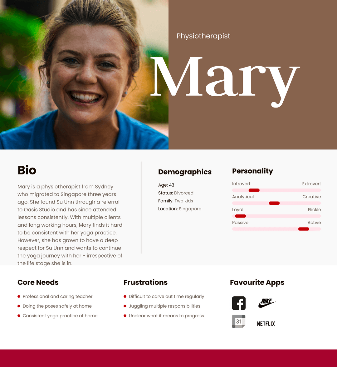
I created a persona representing the median student to help ensure the design process is aligned to the prioritised pain points.
THE CURVEBALL
Because yes, the website addressed user needs. But did it have soul?
With 5 participants of the target demographic (ie. current or incoming yoga students), I conducted an in-person prototype testing using Figma. Although all users successfully completed the assigned tasks without errors or misclicks, they all shared the common sentiment of the site feeing "emotionally empty".
Ouch. But no time to weep, back to Figma.
The Curveball
RE-BRANDING
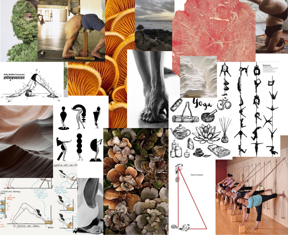
I revised the moodboard to include greater illustrations and textures.
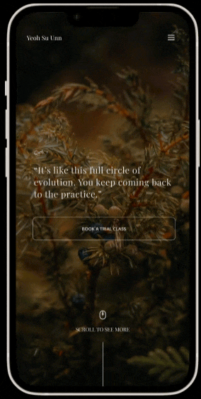
The moodboard predominantly follows a monochrome colour palette with dashes of vibrant colour such as reds and oranges. There is a focus on the human form and its movements balancing a sense of fluidity and stillness. I also prioritised hand-drawn illustrations to add a personal touch.
High Fidelity
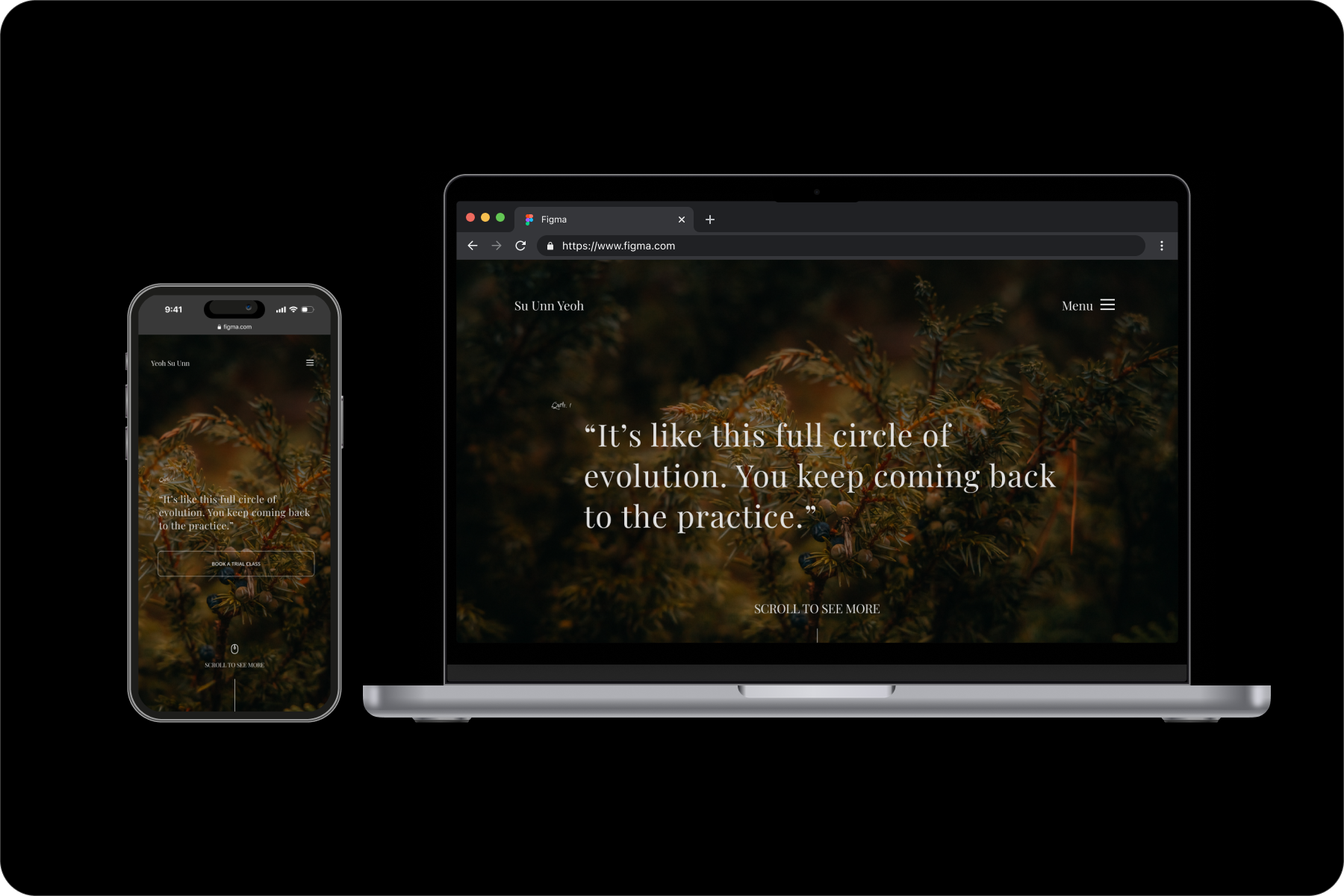
VERSION 2.0
One day later, a vibier interface.
The moodboard predominantly follows a monochrome colour palette with dashes of vibrant colour such as reds and oranges. There is a focus on the human form and its movements balancing a sense of fluidity and stillness. I also prioritised hand-drawn illustrations to add a personal touch.
WHY THIS?
Most students are not at the first stage of the yoga journey. They're just looking for the final push.
As they come from word of mouth referrals, what better way to give the final push than to show them visually what their journey in Iyengar yoga could be like under Su Unn’s guidance.
AN AGEIST ASSUMPTION I SELF-CORRECTED
Just because the target demographic may be older and busy, it does not mean they can’t or don’t want to appreciate experiences
As they come from word of mouth referrals, what better way to give the final push than to show them visually what their journey in Iyengar yoga could be like under Su Unn’s guidance. An ageist assumption I had to correct in my head was that “Just because the target demographic may be older and busy, it does not mean they can’t or don’t want to appreciate experiences.”
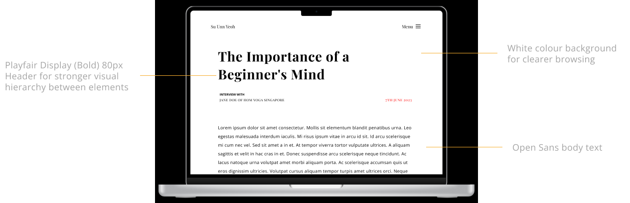
To encourage a relaxed reading experience I maximised the use of white space so each page abides to a simple, considered typographic hierarchy.
Reflections
Challenges Faced
Making necessary sacrifices
From user research, I knew that the target audience is practical and efficient. People who favour logic & saving time. Regardless, I prioritised UI as I did not want to compromise Su Unn’s personal voice. Because the website was meant to carry her blog and be her portfolio. Most students sign up from word of mouth referrals. They’re not at the first stage - they’re looking for the final push, to be convinced. And what better way to give the final push than to show them visually what their journey in Iyengar yoga could be like under Su Unn’s guidance. Ie. the goal became creating a memorable EXPERIENCE for potential students. Not to mention, the corporate startup website templates are losing favour among consumers anyways with their ‘inauthentic vibes’
Ensuring business sustainability
Gen Zs are redefining the wellness industry into a more holistic one addressing physical, emotional and psychological. Since they’re the new demographic, though the target audience is middle aged women, I did my best to create a balance to encourage new leads for Su Unn’s lessons.
Prioritisation
Addressable via a website is a key point I wanted to highlight. Unfortunately just creating a website cannot solve all problems (though it makes for a good portfolio). Hence, I had to sieve out more important grievances in relation to the spiritual practice of yoga for those that have the capacity to be addressed via a website.
On a more logistic note...
I had 15 minutes max for user interviews. There is only so much time you can expect out of a physiotherapist/doctor before she gets back to work. And unfortunately that so happened to be the case for many of Su Unn's students. So I had to be often go off script during interviews, prioritise, and come up with new, relevant questions to unearth more insights.
Final Thoughts
Things that can be improved are better time management to ensure that user interviews can be longer & more substantial. Also perhaps considering to Include an integrated booking system in the future (since client does not want one now). Use photos taken during Su Unn’s classes as visual proof. Next I will be creating other relevant pages such as the schedule, and contact us page. I would also like to incorporate more original visual elements and illustrations. Then, I will be working with Su Unn to select the most suitable website developer platform that balances budget. And will work on creating the website & getting it published.
Other featured works
Evolving mental healthcare for a sceptical and disillusioned generation