Evolving mental healthcare for a sceptical and disillusioned generation
Type: 0 to 1 self-initiated project @Pre-seed stage
Role: Research, UX design, Branding, Usability Testing
Platform: iOS
Design Tools: Figma
*View in Figma application for complete access to user flow
Overview
Mindfulness has become quite the buzzword.
Mental health became a billion dollar industry in the venture capital scene in 2023. Singapore established a National Mental Health and Well-being Strategy in the same year. Even educational institutions organise annual mental health awareness weeks, offer counselling, and distribute welfare packets.
But the message was loud and clear.
Research
With all this treatment and funding, people are worse off. Why?
Published in National Institute of Health Journal, Johan Ormel’s treatment-prevalence paradox (TPP), proposes 3 strong explanations as follows:
(Ormel et al, 2022)
Treatment impact differs substantially for chronic-recurrent cases relative to non-recurrent cases.
- The published literature overestimates short- and long-term treatment efficacy
- Treatments are considerably less effective as deployed in “real world” settings
- Treatment impact differs substantially for chronic-recurrent cases relative to non-recurrent cases.
Note: The fourth explanation of "Treatments having some iatrogenic consequences" is critically deemed to require further exploration since there is little existing research.
In layman terms, if statistics claiming a software resulted in a “32% decrease in anxiety” looks too good to be true?
It probably is.
THE RESEARCH
The backbone of this project.
A solution is virtually redundant if it doesn’t meet the needs of its users.
I conducted both primary and secondary research to understand how the treatment-prevalence paradox applies to the Singaporean context. Five adults, between 21 to 35 years old, currently facing mental health issues were interviewed over a span of a week.
Participants were mainly recruited through linear snowball sampling (Bhardwaj, 2019) creating a biased sample of users who are undergoing or have completed a tertiary education - eliminating the viewpoints of those with lower literacy levels. This reveals the need for trust between participant and researcher to partake in an interview involving the sharing of intimate and sometimes traumatic details of personal lives.
Secondary research involved competitor analysis of the main industry players.
I had to reach the crux of user needs - taking into consideration their tendency to give answers that they think I'm looking for.
Synthesising the main viewpoints of the five :
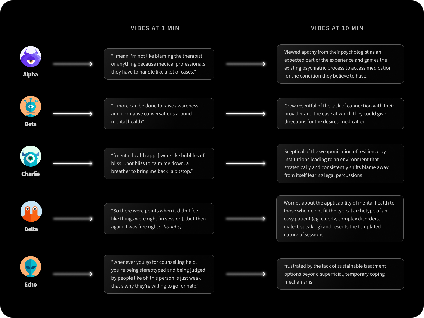
As I was reviewing all the interview transcriptions, peer-reviewed research articles and competitor analysis via an affinity mapping, I noticed a key pattern:
KEY DISCOVERY
All participants had a subconscious focus on power dynamics as a concept.
1. Provider considers themselves expert to Patient
Leads to infantilisation where therapists may rely more on the forms with arbitrary scales previously filled out by patients than the verbal experiences shared by the patient themselves. This leads to a fixed mindset where rapid diagnosis is encouraged. This scenario also often finds patients with a tendency to curate responses to seek the therapist’s approval.
2. Patient considers themselves expert to Provider
Disillusioned users who are distrustful of the system either discontinue sessions or mould answers to get the desired medication. There is a tendency for users to either curate responses to suit their personal agenda (eg to obtain desired diagnosis or medication) or attend a session to prove themselves right: that mental healthcare treatment is ineffective at best and harmful at worst. They are convinced that to access the treatment (they believe is best for them) can only be done by gaming the system.
3. Patient vs Provider / Institution
Distrust is prevalent in this scenario with both parties. When mental healthcare services that prioritise institutional needs over its users are met with disillusioned users, there is no collaboration or therapeutic alliance formed. When patients perceive providers as seeking to find out if they are a liability to partnered organisation, and providers deem patients non-cooperative, it quickly leads to animosity. There is a lack of transparency in the process with both parties curating responses to prevent the access of the complete truth deemed detrimental on their personal behalf. This typically takes a huge toll on patient care, as they undergo further disillusionment.
INSIGHT INTO UNTAPPED TARGET AUDIENCE
We can target users who either consciously or subconsciously distrust their psychologist — instead curating responses to suit a personal agenda
KEY ISSUE
Figuring out what to build
Based on my primary personas’ story, I created a problem statement that impacts users (beyond mere inconvenience).
Users are disillusioned with therapy due to prior negative experiences, wishing to find a treatment platform that prioritises their patient-provider connection and rich discussions.
Since there are many direct competitors, I could learn from their existing services and in the process noted key differentiators between the major players.
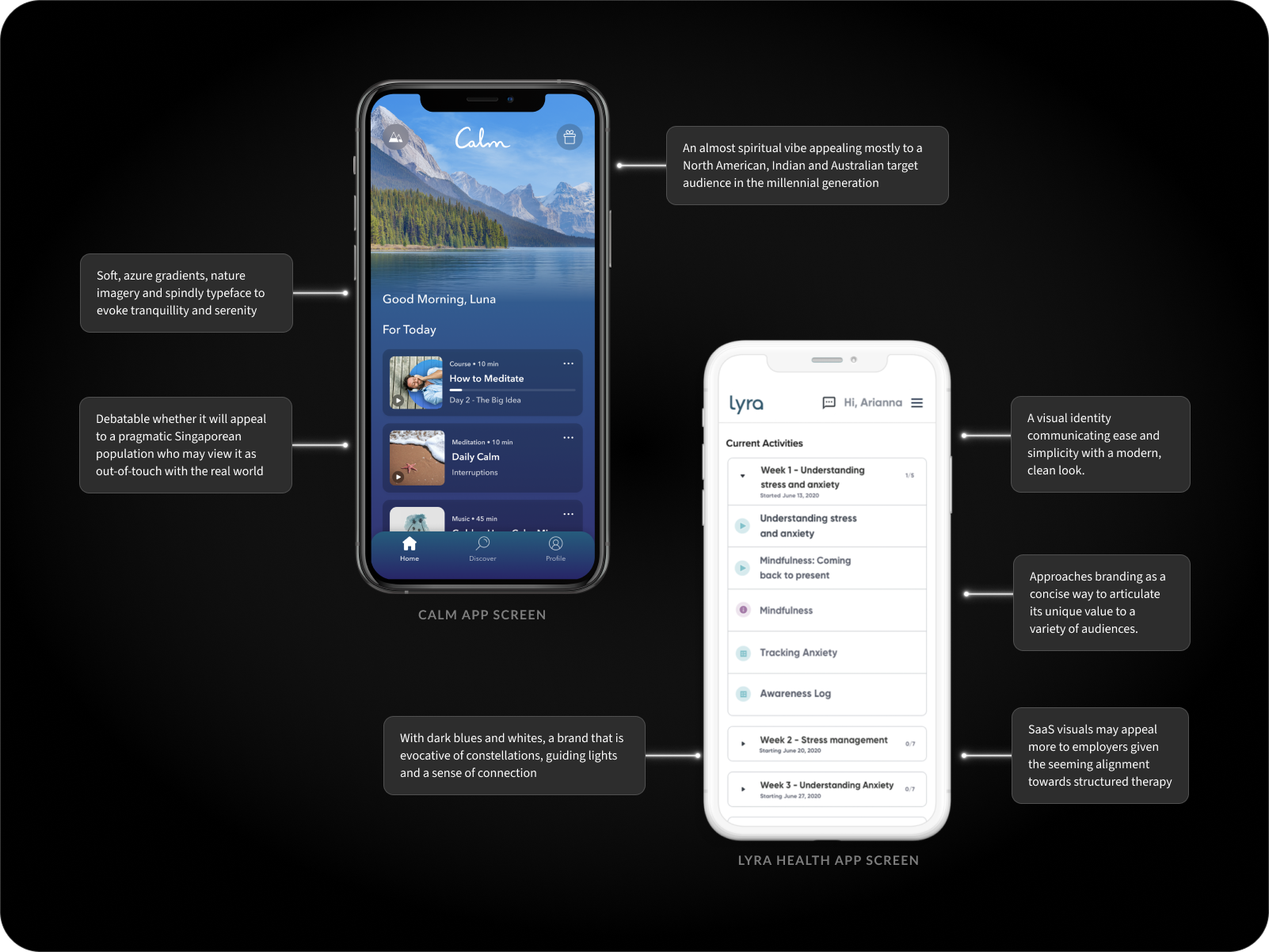
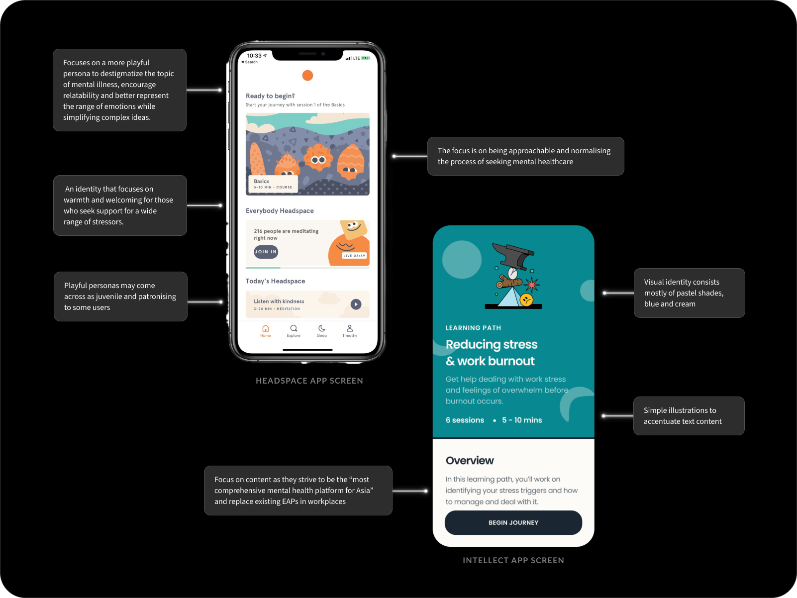
All four have adopted identities to suit their target audience at the time of founding.
But this is a generation raised on live streams of wars, genocides and terror attacks.
A generation that has grown disillusioned with existing institutions and powers in place. So I’m compelled by something that grounds users with a direct and straightforward tone. A no fluff, open attitude taken towards less palatable aspects of mental health.
To clarify what features would serve my users best, I laid out and prioritised the main unique value propositions to address my personas’ needs and frustrations:
1. A personal account to store relevant data → secured data is transferred efficiently at user’s request when switching providers (eg. includes medications, institutionalisation records, personal narrative, treatment plan with a future progression pathway)
2. Onboarding to set user preferences
3. Mental healthcare articles with more relevance to 2024 (eg. caregiver stress, gender identity, censorship, eco anxiety)
With the problem statement set out,
An accessible singular platform that can accommodate an individual’s specific context and needs on their mental healthcare journey while focusing on better metrics for improvement.
We now have a list of the most useful features to start developing.
Solution
CREATING TINY STRUCTURES IN A HAYSTACK
Addressing the crux of the problem.
I began exploring emerging opportunities:
How might I replace disillusionment with curiosity and intrigue?
How might I create an effective way to evaluate therapeutic sessions?
How might we allow users to update their various circumstances in an informed way so as to provide personalised care?
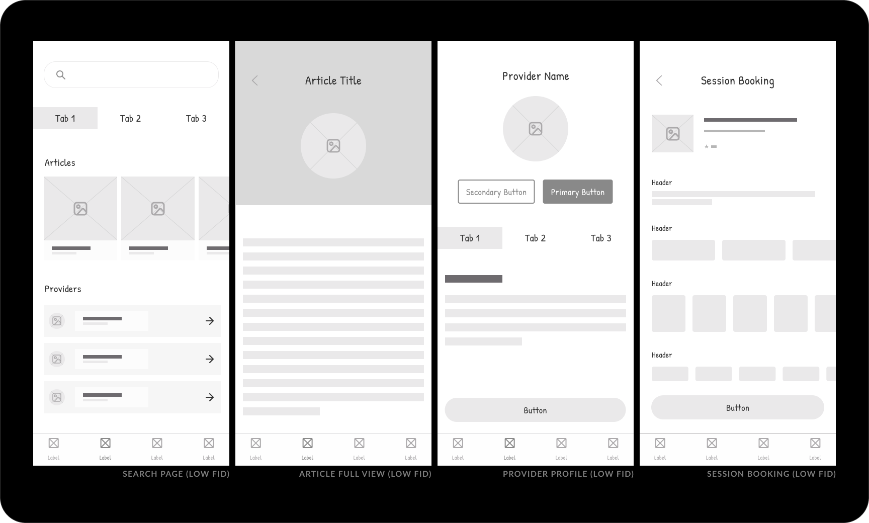
To make sense of an otherwise huge amount of information, I started by exploring ways to foster a perceived sense of progress. I decided to pin down certain ideas into a couple solid low fidelity wireframes on the user-facing side of the application for the key flow: booking a session with a provider.
Quickly, an important issue was raised.
Will a boilerplate explore feature address user needs?
The first iteration (Figure 1.0) followed standard industry practices of exploring articles, review profiles, then book sessions. There is a high emphasis on text-heavy content supported by natural reading behaviour.
Early feedback from peers noted that
“Who even reads articles in 2024?”
“Feels a bit in my face to book a session so quickly.”
This led to a second iteration where articles are replaced with provider-generated video content.
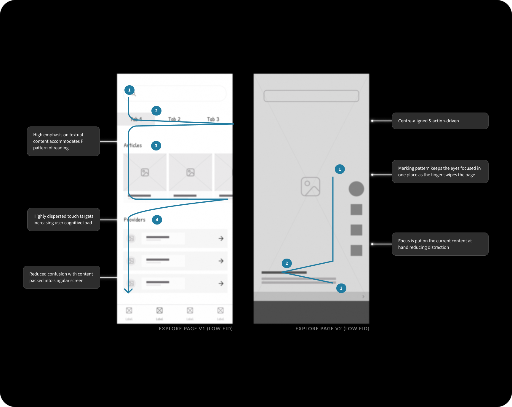
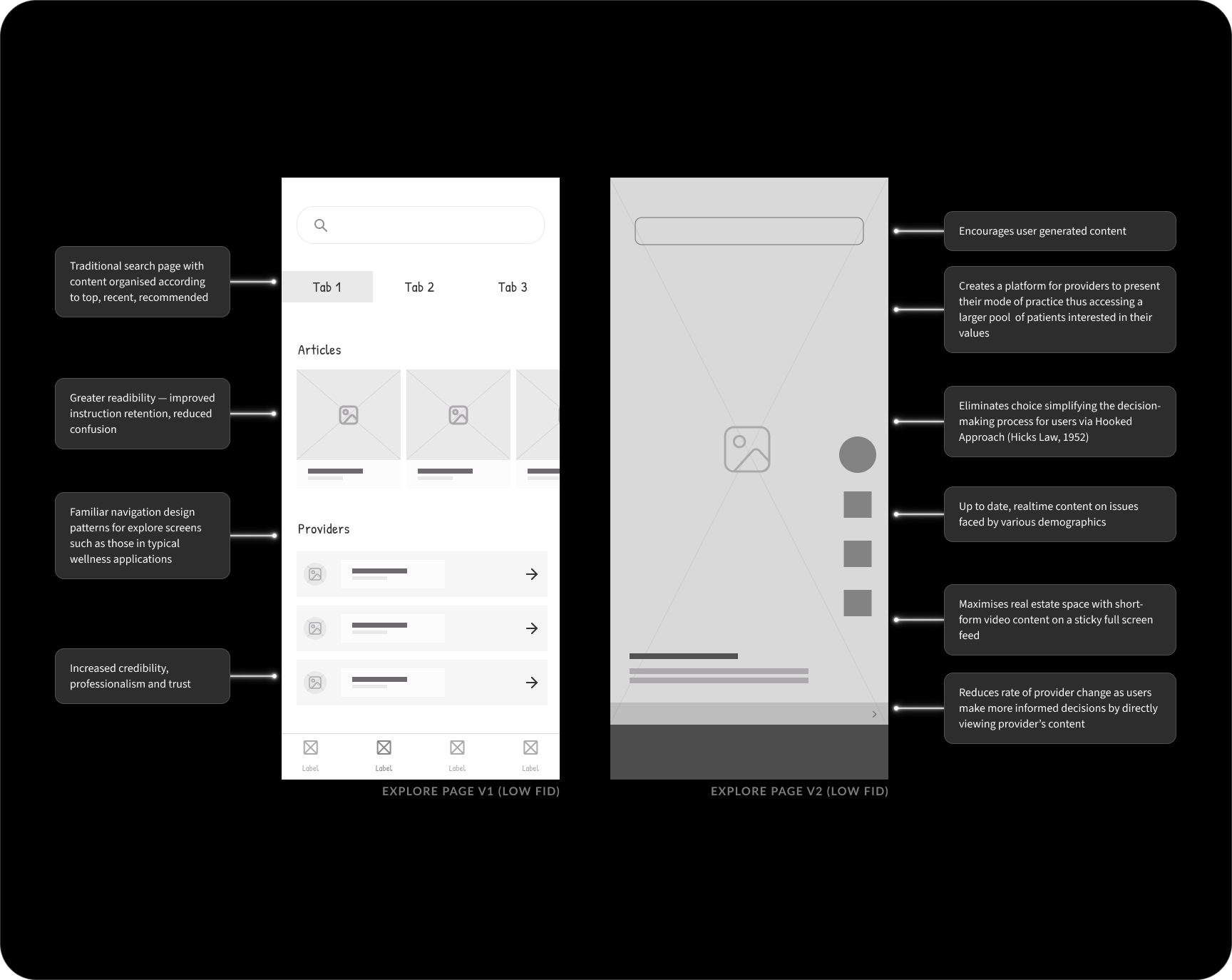
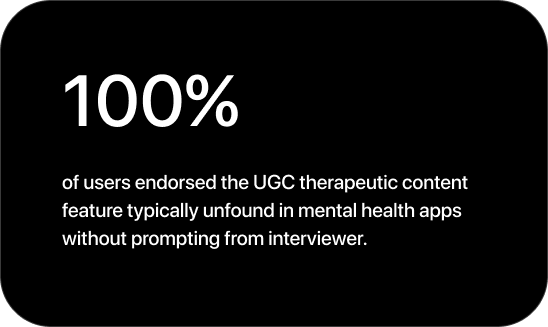
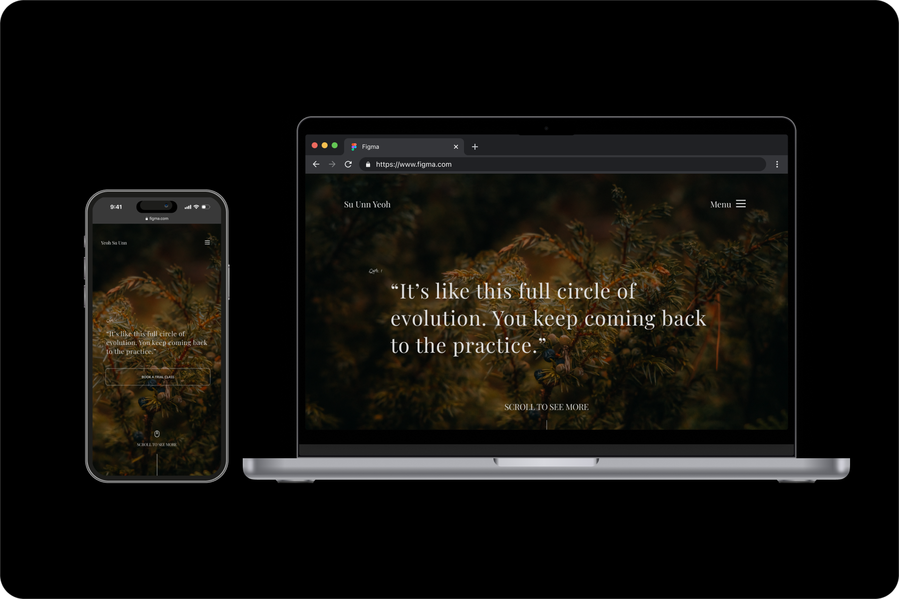
Leveraging the content of providers can reach audiences who are unable to and/or unwilling to embark on a care treatment plan in their environment – often due to structural inequities and distrust. Posts reflecting individual values and practice also focus on non-clinical narratives around distress that are equally important. Quality of users choices when selecting a provider improves and power differential is tempered with users being able to directly engage in posts. It also centres lived experiences over rigid classifications – which often fail to take into consideration forms of distress that may require social, political or economic change for relief.
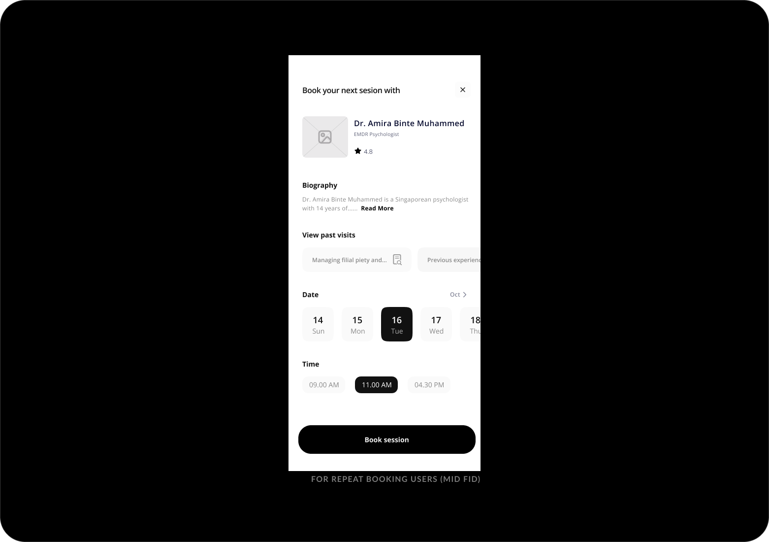
The booking session screen (above) is also split up into three separate screens.
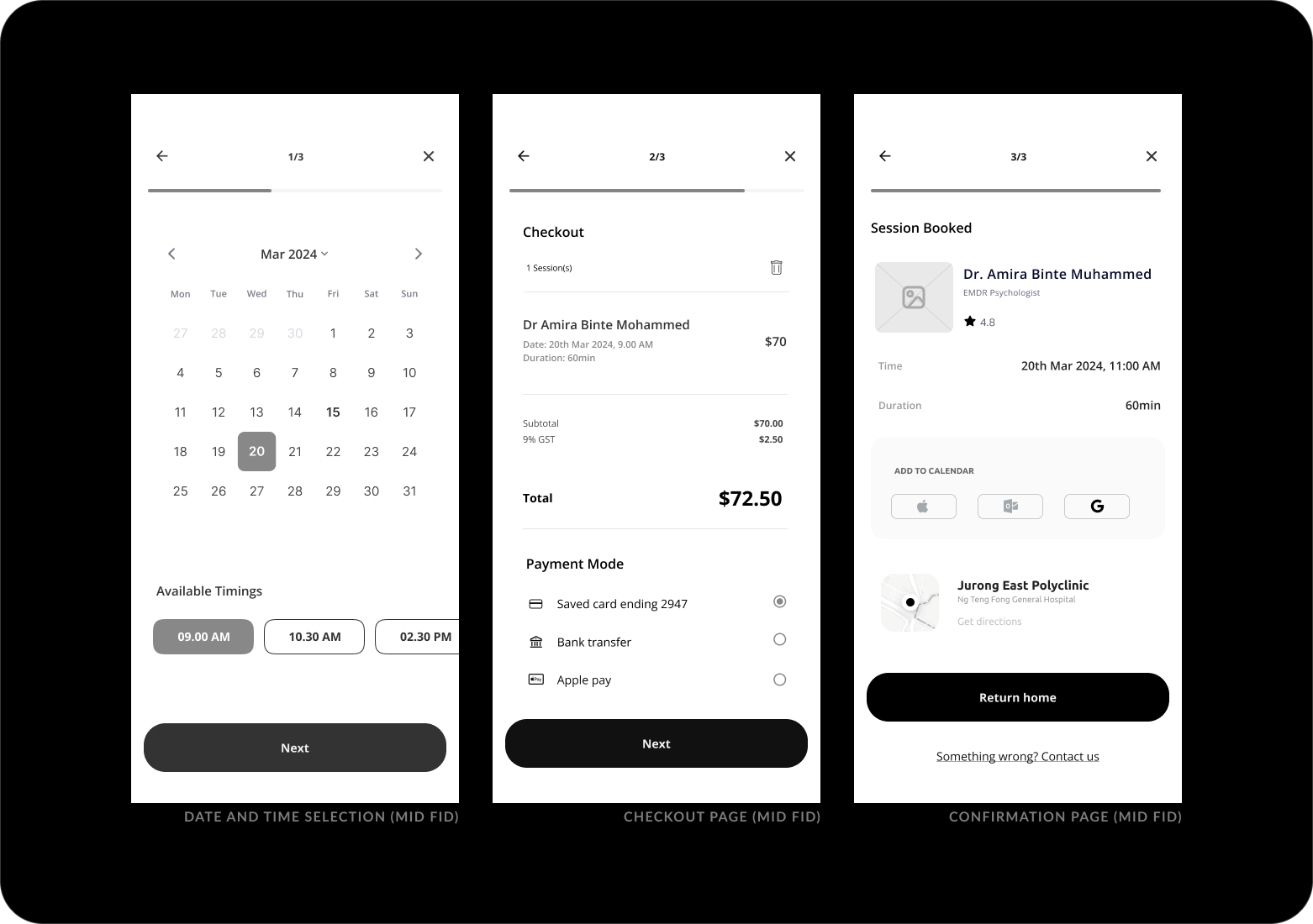
By splitting the checkout process into more steps, I add positive friction because saving taps here came at the expense of clear comprehension.
The original screen on the left can be used by repeat users who wish to have a quick rebooking.
With the key business flow settled, I move on to finishing up the rest of the task flows, followed by low fidelity wireframes.
Including patient-generated data within treatment plans.
The narrative feature allows users to decide the meaning of their narrative beyond that created by external formal institutions and share easily with providers. It allows for user-centric language and syntax in describing symptoms as well as how they experience and express distress.
.png)
.png)
Similarly, users can review (aka reflect on or feedback) each session. This serves as a good benchmark for both patients and providers to reflect on how each session went.
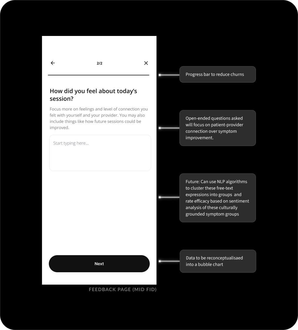
Providers may have concerns regarding the quality, trustworthiness, sufficiency, significance and completeness of these patient-generated records. In this app, I am looking to maximise the value of PGHD by improving their mechanisms in data interpretation by providers.
To address this, three measures are added:
1. Entries that are edited beyond the 24h cooling period will be marked ‘edited’.
2. Timeline structure adopted for provider’s ease of reference
3. Word limit to restrict length of data entry
Now, the mid fidelity prototype was ready to be put in the hands of potential users.
How will users behave?
I recruited 5 moderated participants for a usability study to observe how easy or difficult users found book sessions and adding events to their narrative.
Participants were presented with 4 tasks matching the balancing the business goals, as well as the most important task for the business: booking sessions.
1. Complete onboarding
2. Booking a session with a provider
3. Creating a narrative event in Origin card
4. Sharing feedback on previous sessions
After the test results and sharings by participants, there are some improvements to be made:
All tasks had a 100% completion rate. However, 3 out of 5 users took on average 2 minutes to book a session with a new provider. While it seems like a flaw to be addressed, I decided against changing the design so as to encourage users to work with existing providers. This way the likelihood of users 'therapist-shopping' will be reduced. Lastly, participants did not understand the purpose of feedback and data visualisation aspect. A help button can be added to explain sentiment analysis and its relevance. There are some readability issues with font size on some screens.
We now had data-led benchmarks for comparison with future tests, and a clear priority for the next iteration had emerged: ensure the ability to ‘change providers’ is evident even in the repeat booking screen.
I iterated on the mid fidelity designs once more, ensuring a solid foundation for the visual design stage. Changes included enlarging fonts, ensuring consistent alignment, and revising CTAs for greater clarity.
High Fidelity
VISUAL DESIGN
Creating high fidelity wireframes.
I began moving into visual design by collecting references, research, and inspiration for the branding.

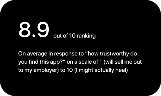
I knew that trust and a ‘no bullsh*t’ attitude is important to my users, and I wanted the visual language to reflect this feeling of pragmatism and security.
Given the short deadline and scale of design, it would be redundant to create an entirely new design system for this project. So I periodically reviewed Apple’s Human Interface Guidelines for an immediately familiar and usable app.
I maximised the use of atomic Material Design elements and characteristics and created custom components on a per-need basis.
Keeping an old school layout.
A soft 8 column grid combined with 16px margin structures the app screens in a way that is flexible and logical to develop.
Spacing is kept to defined 8px intervals, and auto layout is used when needed for speed and flexibility.
A sticker sheet (ie. a simple design system) ensures all components and styles are consistent, and keeps track of variants like error states.
Readable, responsive cards.
As a highly critical component that appears in most screens to organise the content, I adopted the design from Material Design 3 so that it prioritised readability.
At the same time, I focused on responsiveness and i18n.
I focus on documenting design specs to bridge the design-engineering gap and allow for a seamless developer handoff.
Icons for Origin
Tab bar icons are an airy, open, 1px outline style that are filled when active.
Functional icons are slightly heavier for visual balance, as they often appear in isolation.
Impact
USABILITY
At the end of the day, does the app work?
I set up a Figma prototype and sought another round of design critique. I also ran a second usability study at the same time, looking to implement insights from both sessions together.
Using the same tasks from the first usability study, I gathered data and feedback from 8 participants.
Once again, all tasks are completed with a 100% success rate.
Future research should involve the visuals’ effects on cognitive load with a diverse participant pool.
An MVP that's ready to be built.
There are always more improvements to make, but at this point I was happy with calling the app ready to build.
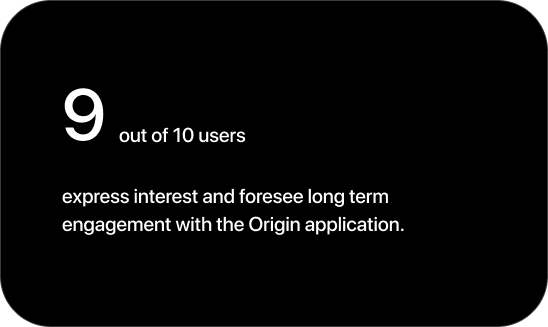
Users were completing tasks with ease, comprehending visual and written language, and most importantly converting.
Every participant was able to create a profile and book a session, and many mentioned that they would trust the app to help guide them during their mental health process, which meets the original goal statement.
Future releases could account for strategic business decisions.
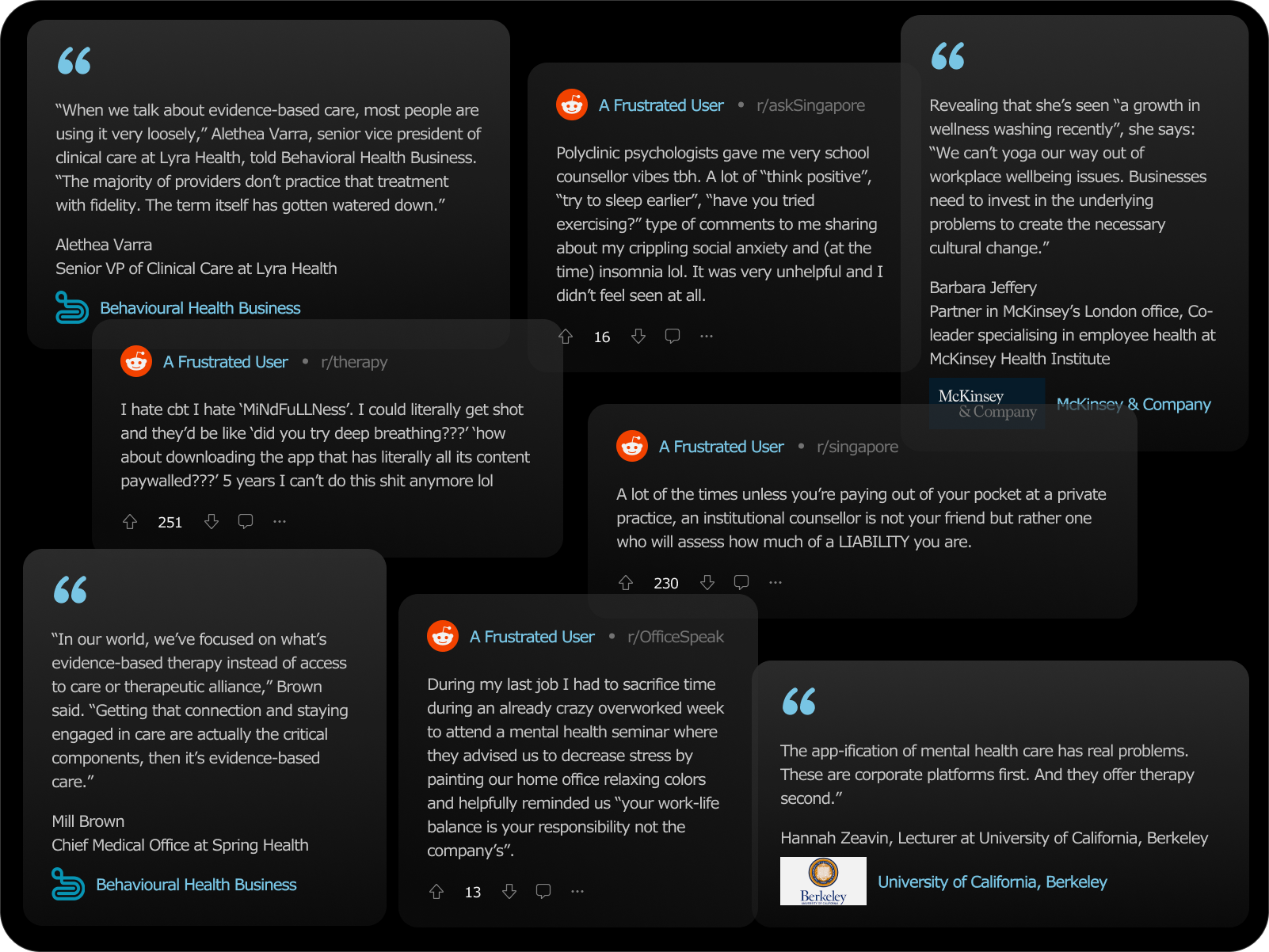
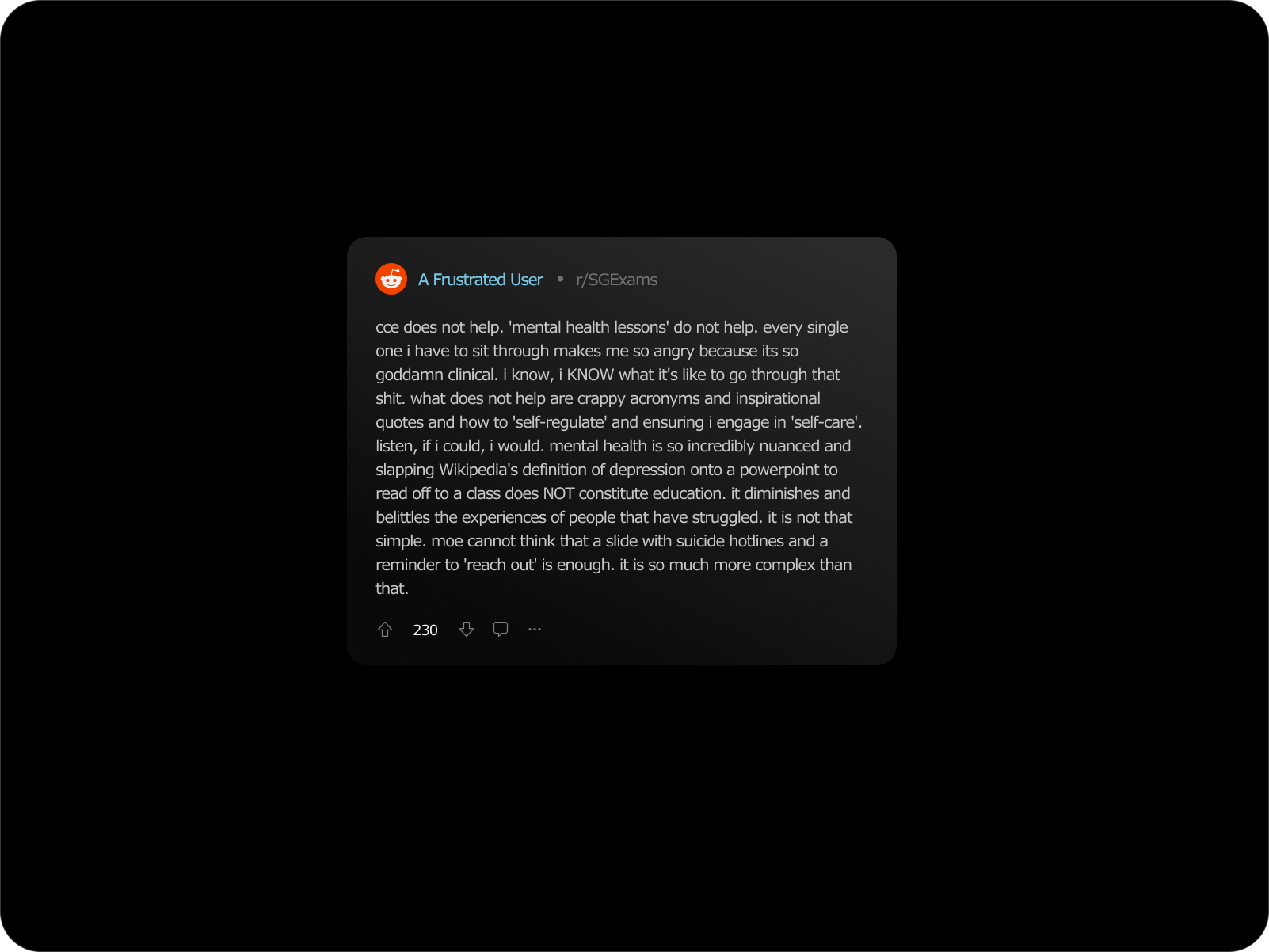
What do users say?